
NZAgbiz
NZAgbiz is New Zealand’s leading supplier of animal milk replacers and specialist animal health supplements.
My design won the design pitch, and the clients wanted to move ahead with minimal changes to my design. I was tasked with rebranding the company, as well as updating their existing packaging.
The resulting brand has a corporate sensibility, using vibrant colours and bold typography to distinguish between, and help bring the various animal products to life.
My role: Lead Designer/Art Director
Scope
Visual identity
Design system
Brand Guidelines
Creative collateral
Credits
Creative Direction: Matt Campbell
Agency: Federation
Client: NZAgbiz

A Fonterra* business unit, NZAgbiz saves dairy products that are not good for human consumption from going into landfill, and won a Commendation at the prestigious 2018 NZI Sustainable Business Network Awards for its work.
*Fonterra is one of New Zealand’s largest companies and a multinational dairy co-operative owned by around 10,000 New Zealand farmers. Fonterra is responsible for approximately 30% of the world’s dairy exports.


In addition to creating the various logos, I also created four custom typefaces to be used throughout the campaign.
These were designed in layers that make up the final look by placing each layer on top of the other. This enables the designer to create a shadowed typeface that can have a depth and variety of colours.


Recipe for the collateral system
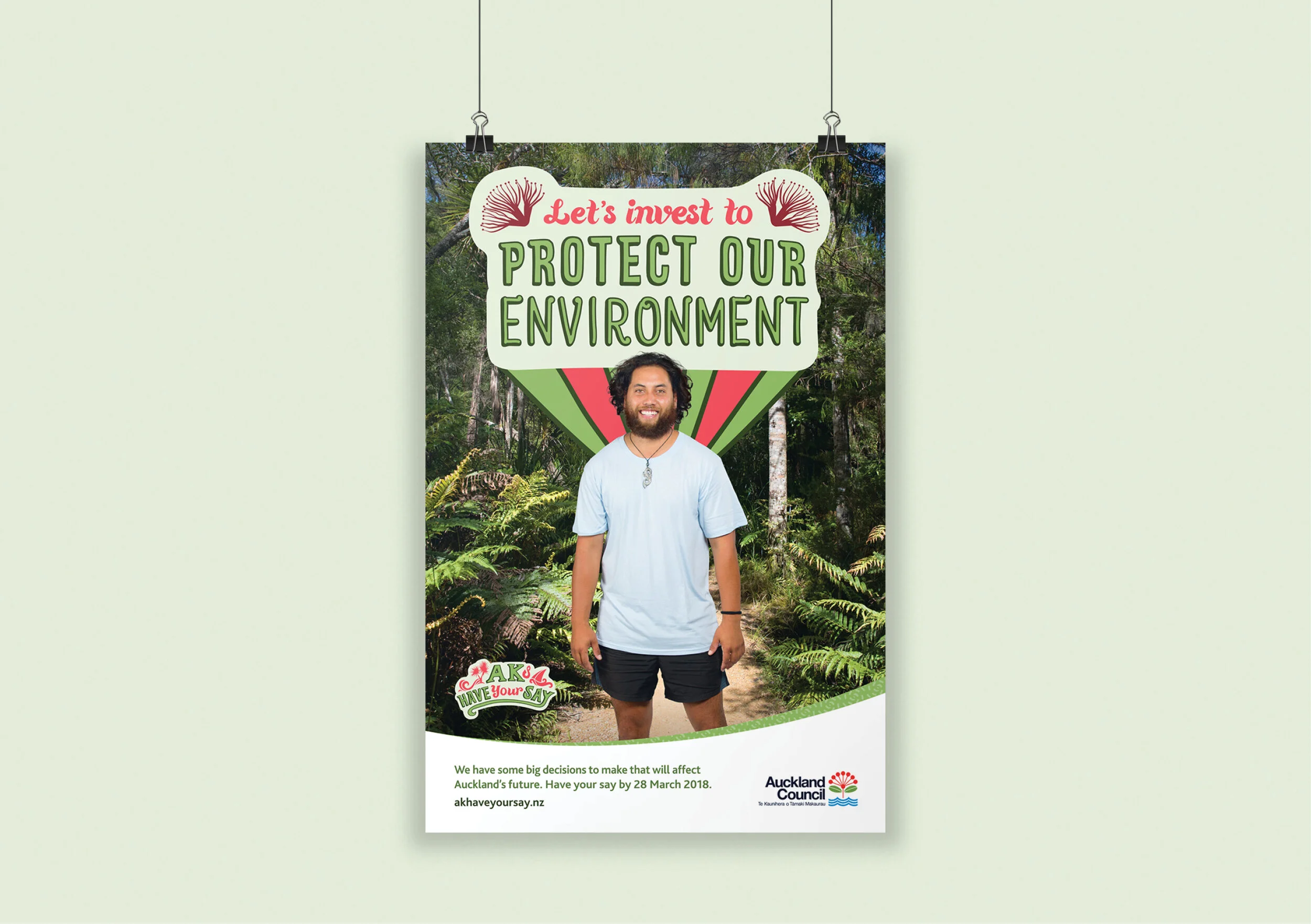
The campaign was rolled out on social media, digital ads for bus stops, posters and YouTube.
The collateral introduced topics up for discussion in the consultation.
I used a loose illustration and lettering style to keep the campaign messaging and topics feeling friendly and approachable.


Results
To help boost the ethnic voice in the feedback and truly reflect the rich diversity of Auckland City, we geo-targeted areas of the city through colour and iconography. The resulting campaign felt friendly and approachable through the use of a loose illustration and lettering style.
Auckland Council found a 28% growth in submissions from previous consultations.